How to Add a Sticky Side Nav to Your Kadence WordPress Site
A sticky side navigation bar is a great way to enhance user experience by providing quick access to important links while scrolling. With Kadence Hooked Elements and a bit of custom CSS, you can easily add a stylish sticky side nav to your Kadence-powered WordPress site.
You can see this sticky nav in action on the right side of the desktop view of this post.
Step 1: Create a Hooked Element
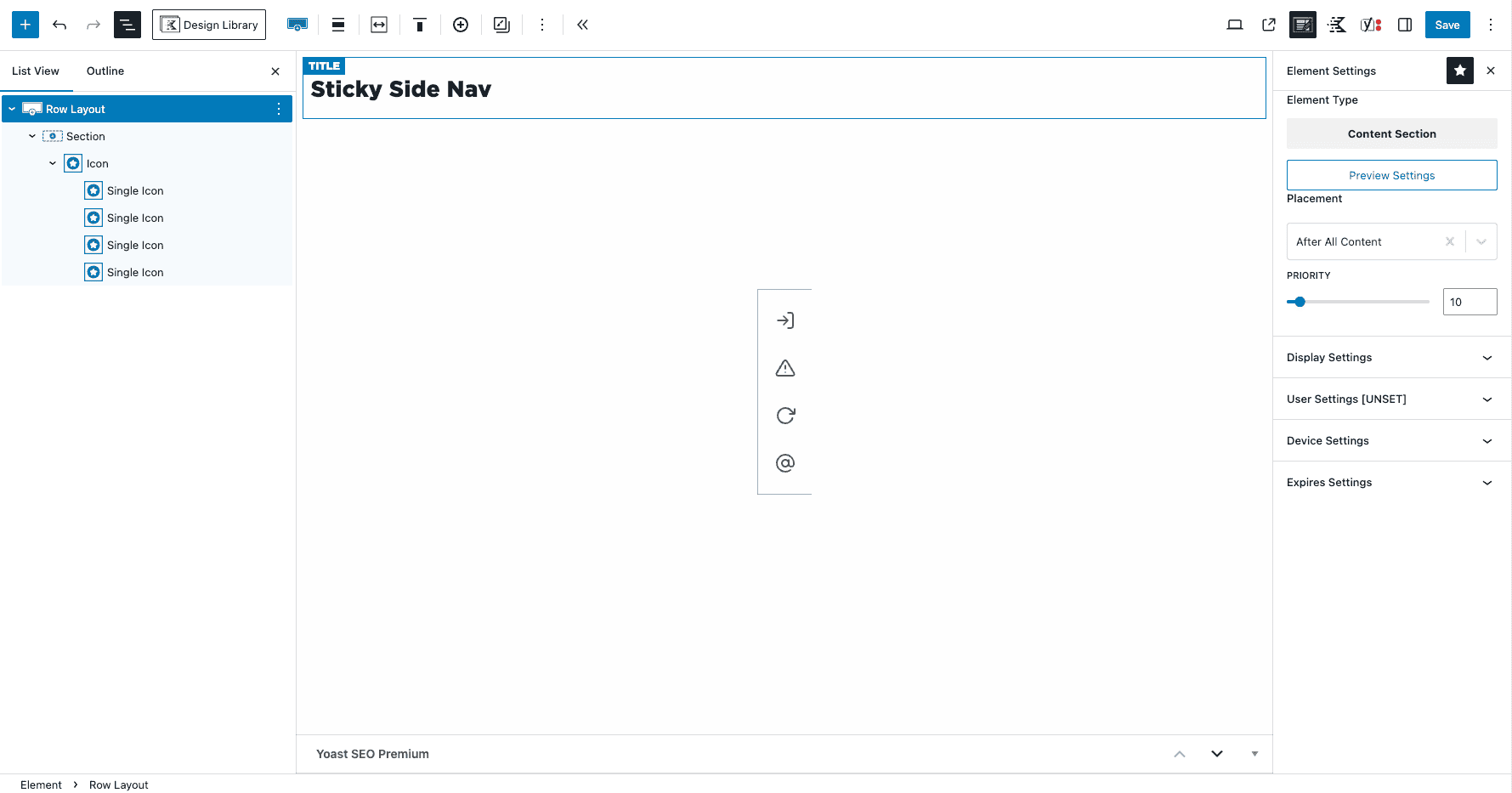
Kadence Hooked Elements allow you to insert custom content anywhere on your site. To create your sticky side nav:
- Navigate to Appearance > Kadence > Elements and click Add New.
- Choose Content Section as the element type.
- In the Placement settings, select After All Content to ensure it appears on every page.
Step 2: Build the Sticky Side Nav
Now, let’s structure the navigation bar inside the Hooked Element:
- Inside the Kadence Blocks Editor, add a Row Layout block.
- Inside the Row Layout, add an Icon Block.
- Add all the icons you want, linking each one to its respective page or section.
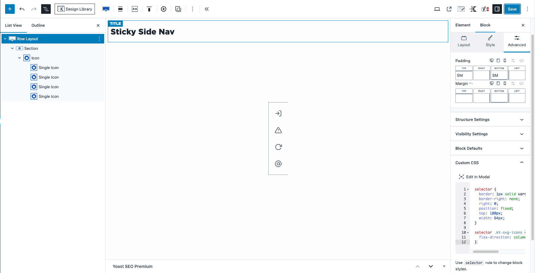
Step 3: Add Custom CSS
To make the navigation bar sticky and style it, add the following CSS in the Row Layout’s Custom CSS section (under the Advanced tab):
selector {
  background-color: var(--global-palette9);
  border: 1px solid var(--global-palette6); /* Adjust color to match your design */
  border-right: none;
  right: 0;
  position: fixed;
  top: 180px; /* Adjust to align with your header */
  width: 64px;
}

selector .kt-svg-icons {
  flex-direction: column;
}
Explanation of the CSS:
background-color: var(--global-palette9);– Sets background color so other elements don’t bleed through, using Kadence’s global color palette.border: 1px solid var(--global-palette6);– Adds a left border for visibility, using Kadence’s global color palette.right: 0; position: fixed;– Pins the nav to the right side of the screen.top: 180px;– Positions the nav to avoid overlapping the header (adjust as needed).width: 64px;– Sets the width for a compact but clickable design..kt-svg-icons { flex-direction: column; }– Stacks the icons vertically.
Step 4: Publish and Test
Once your Hooked Element and CSS are set, click Publish and check your site. Your sticky side nav should now appear on every page, offering easy access to key links without disrupting the layout.
Bonus: Customize Further
- Adjust the border color and placement to fit your design.
- Use additional CSS for hover effects or animations.
- Add visibility settings in Hooked Elements to show the nav only on specific pages.
With Kadence, adding custom elements like this is quick and intuitive. Try it out and give your site a sleek, user-friendly navigation boost!